AUSSIE
Un rebranding que convierte el origen australiano en el principal activo de la marca para volver a destacar en el retail brasileño.
Rebranding Sistema de identidad KV & Toolkit Diseño de packaging
- Brasil
Aussie llegó a las góndolas brasileñas en 2015, de la mano de P&G, para disputar uno de los rubros más competitivos del cuidado personal. La marca ya tenía territorio propio. El origen australiano estaba en el nombre y en el canguro del logotipo, pero todavía no organizaba el diseño del producto.
UNA IDENTIDAD SIN DIFERENCIACIÓN
En la categoría de cuidado capilar, las marcas compiten con promesas parecidas. Hidratación, nutrición, control del frizz, definición de rizos. Aussie prometía lo mismo que sus competidores y tenía un repertorio que ninguno de ellos podía usar. Ese repertorio vivía en el texto de la etiqueta, adonde el consumidor solo llega con el envase ya en la mano. El canguro firmaba la marca y el violeta ya era reconocible, pero el origen australiano todavía no decidía qué entra y qué queda afuera de cada pieza.
EL ORIGEN COMO TERRITORIO PREMIUM
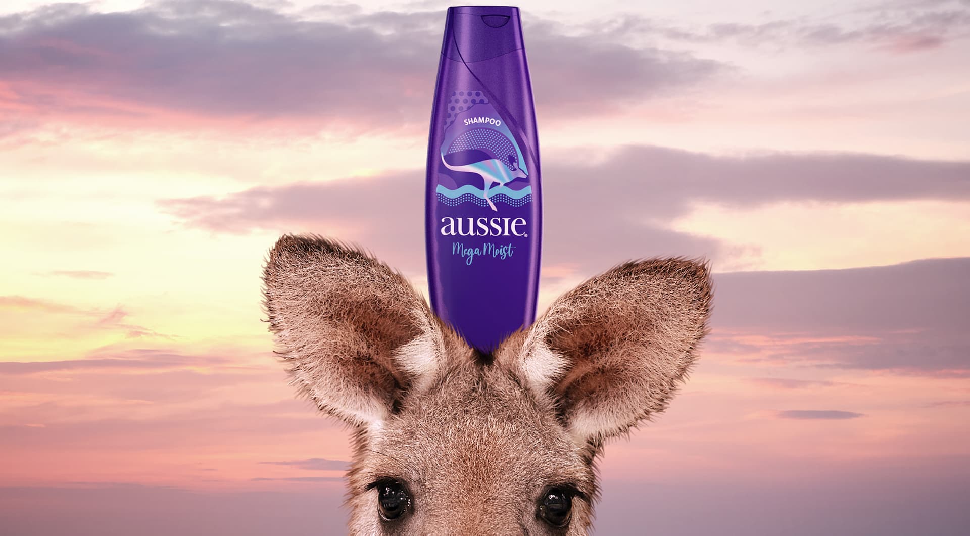
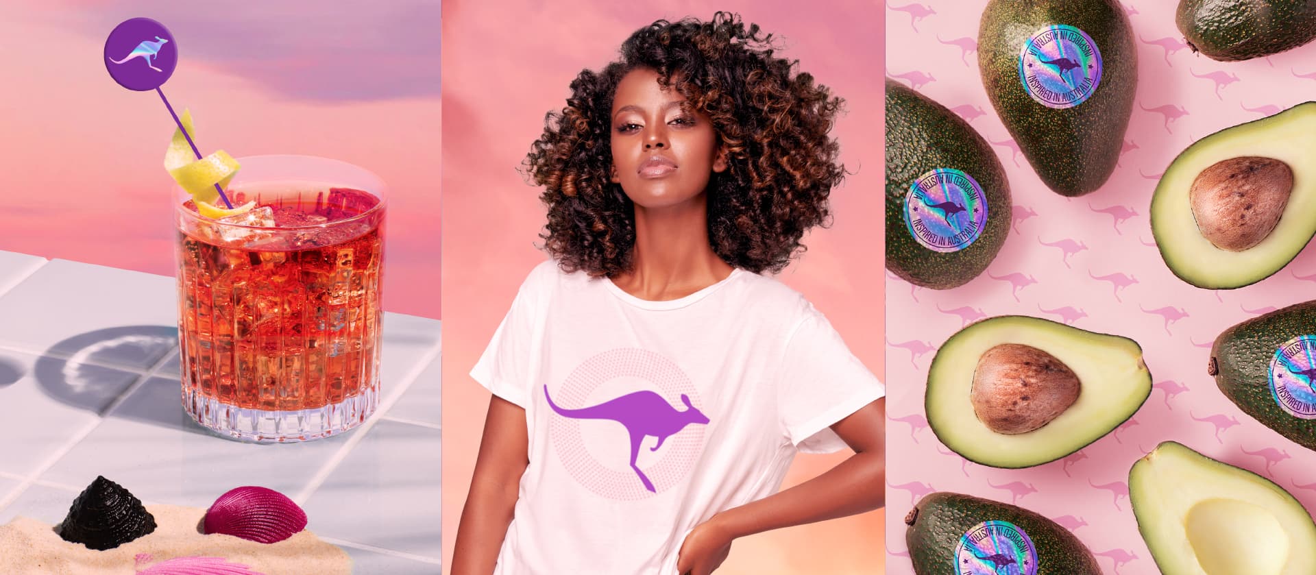
En 2019, la decisión fue reposicionar a Aussie en el territorio premium que sostienen sus raíces australianas, para que el origen apareciera antes de que el consumidor leyera la etiqueta. A partir de ahí, cada elemento pasó a responder la misma pregunta. ¿Esto carga procedencia o solo decora el envase? El canguro fue el primero en cambiar de función. Dejó de ser apenas una firma y se convirtió en el activo principal de la marca, con regla propia de aparición. Aparece en cada pieza y en cada escena de forma inesperada, casi subliminal, como algo que ya estaba ahí.
CINCO ACTIVOS CON LA MISMA PROCEDENCIA
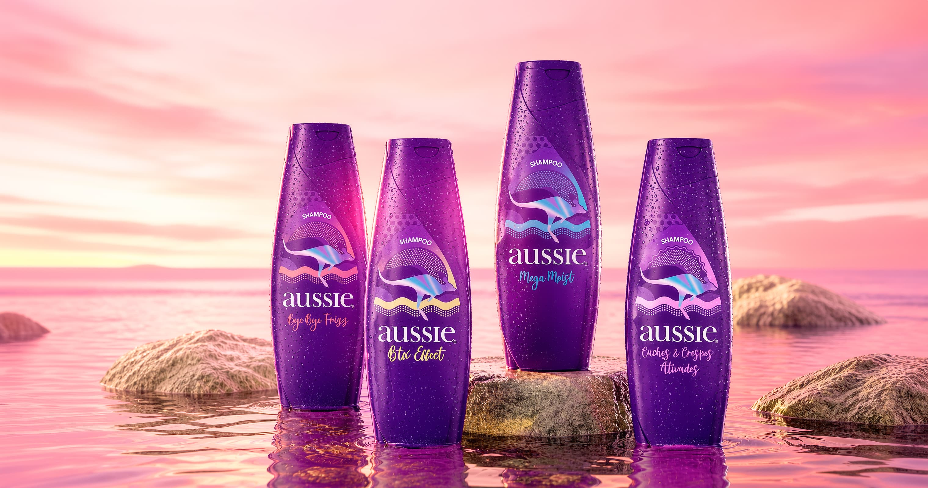
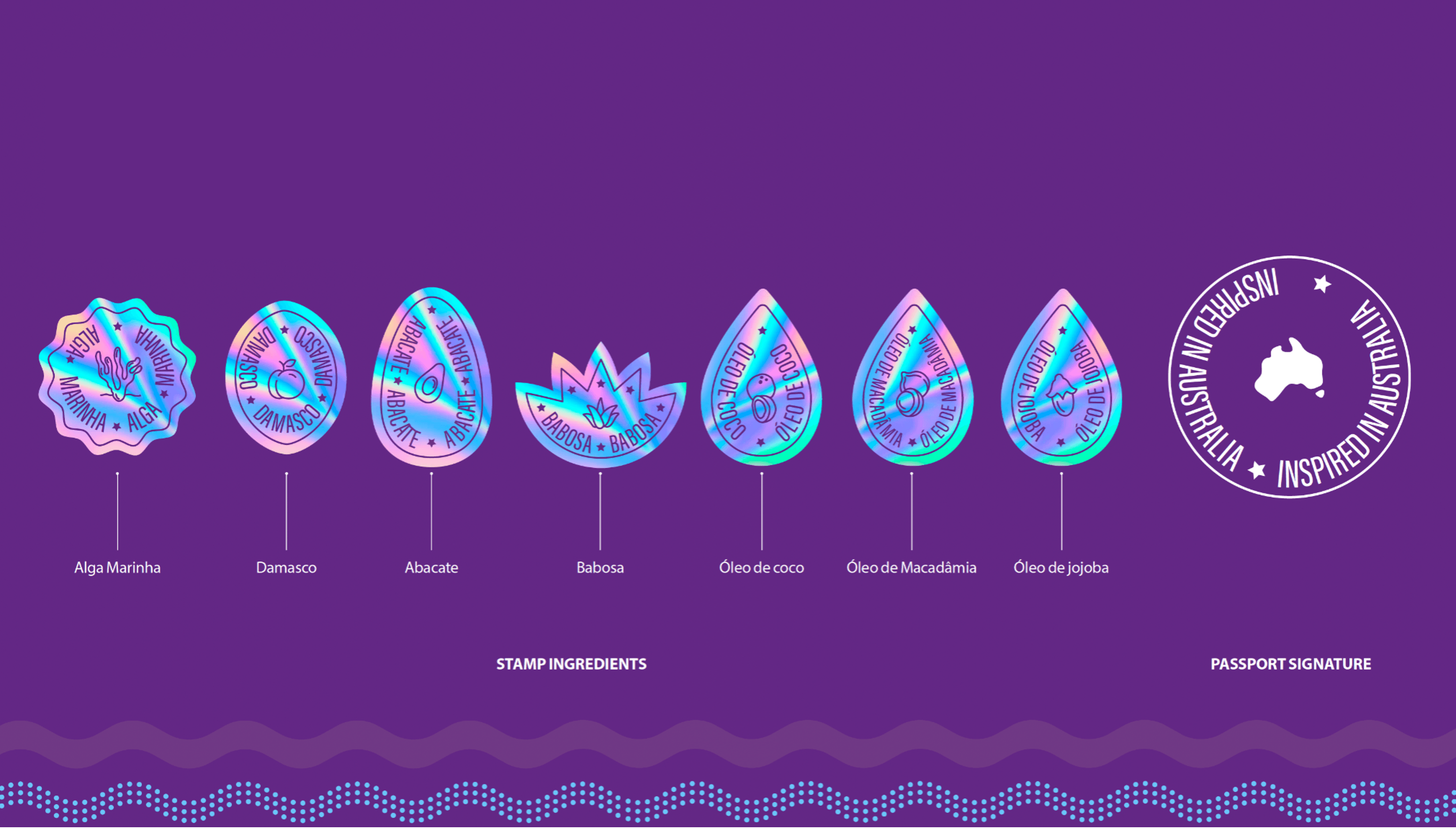
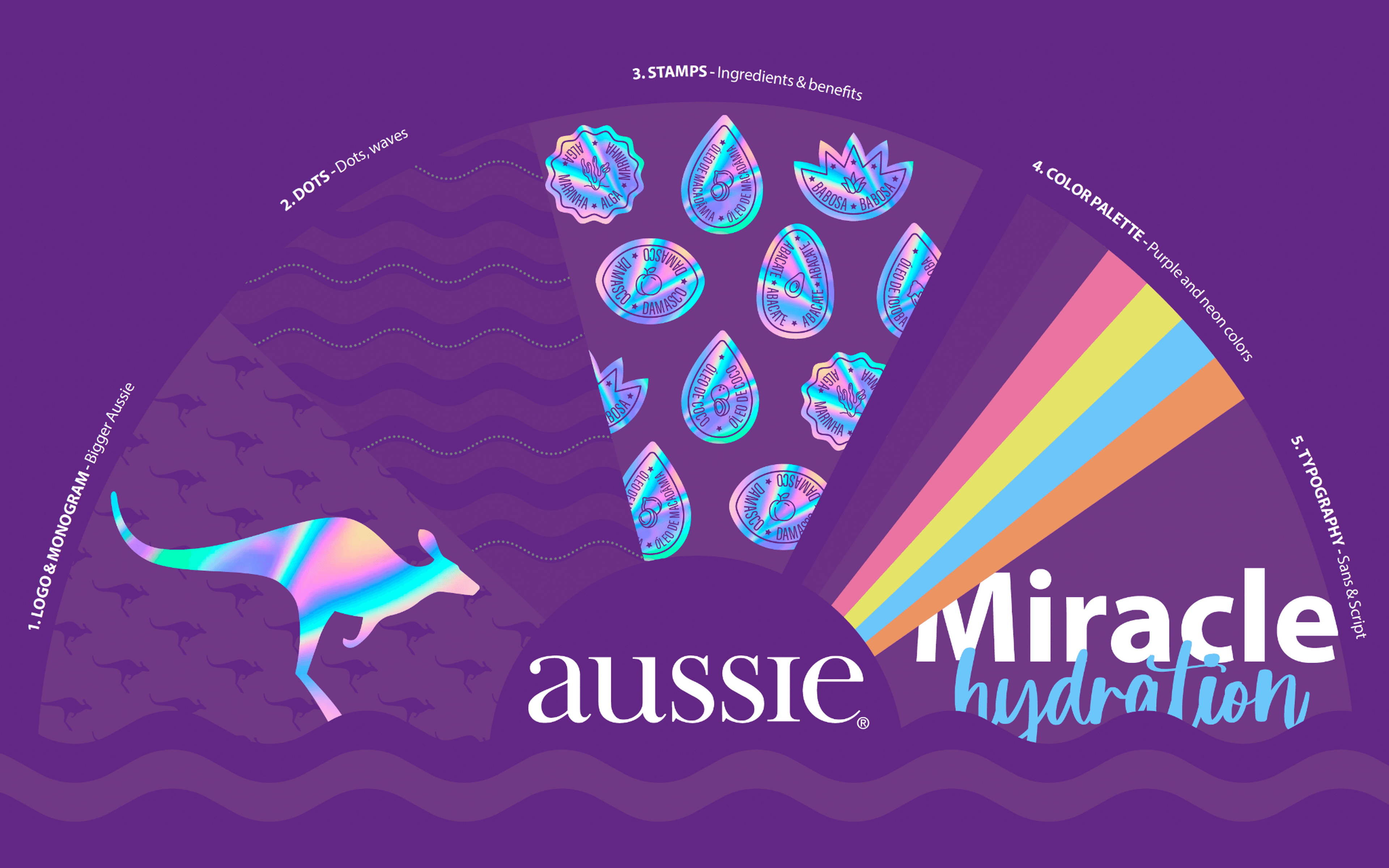
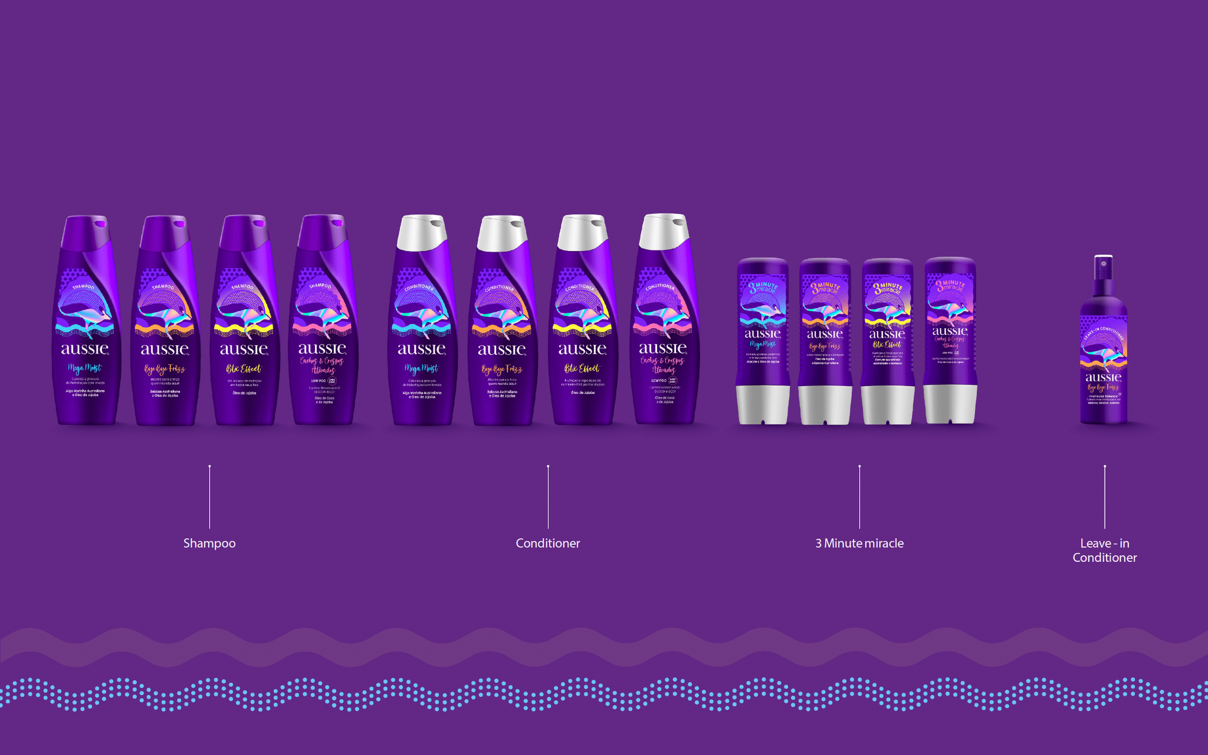
El sistema reúne cinco activos icónicos, cada uno con función declarada y límite de uso. Juntos hacen que una pieza se reconozca como Aussie incluso sin que aparezca el logotipo. Los que cargan la decisión de procedencia son los sellos de ingrediente. Alga marina, damasco, aguacate, aloe y los aceites se convirtieron en sellos de pasaporte holográficos, cerrados por una firma circular con el mapa de Australia. Es el punto donde la estrategia toca el producto. El ingrediente deja de ser información de etiqueta y pasa a ser prueba de dónde vino. Mega Moist, Bye Bye Frizz, Btx Effect y Cachos & Crespos Ativados comparten la misma estructura gráfica, cada línea con su código de color y su lettering.
ICÓNICO EN TODOS LOS PUNTOS DE CONTACTO
La raíz australiana de la marca salió del discurso y pasó a la práctica. El sistema de identidad empezó a reflejar los elementos que componen la marca en todos los puntos de contacto, en un conjunto de piezas, packaging y activos que identifican a Aussie de inmediato y la separan de sus competidores.
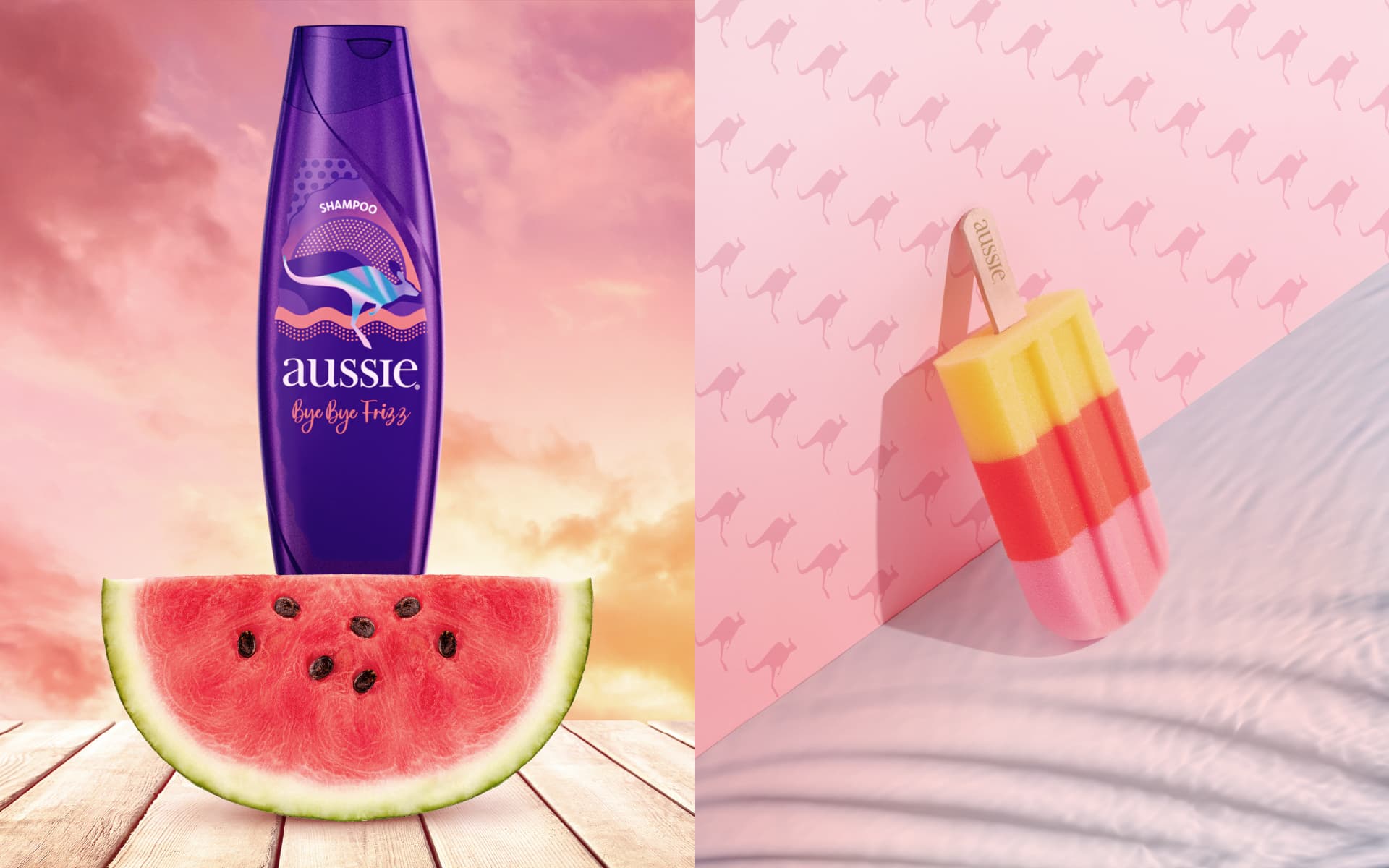
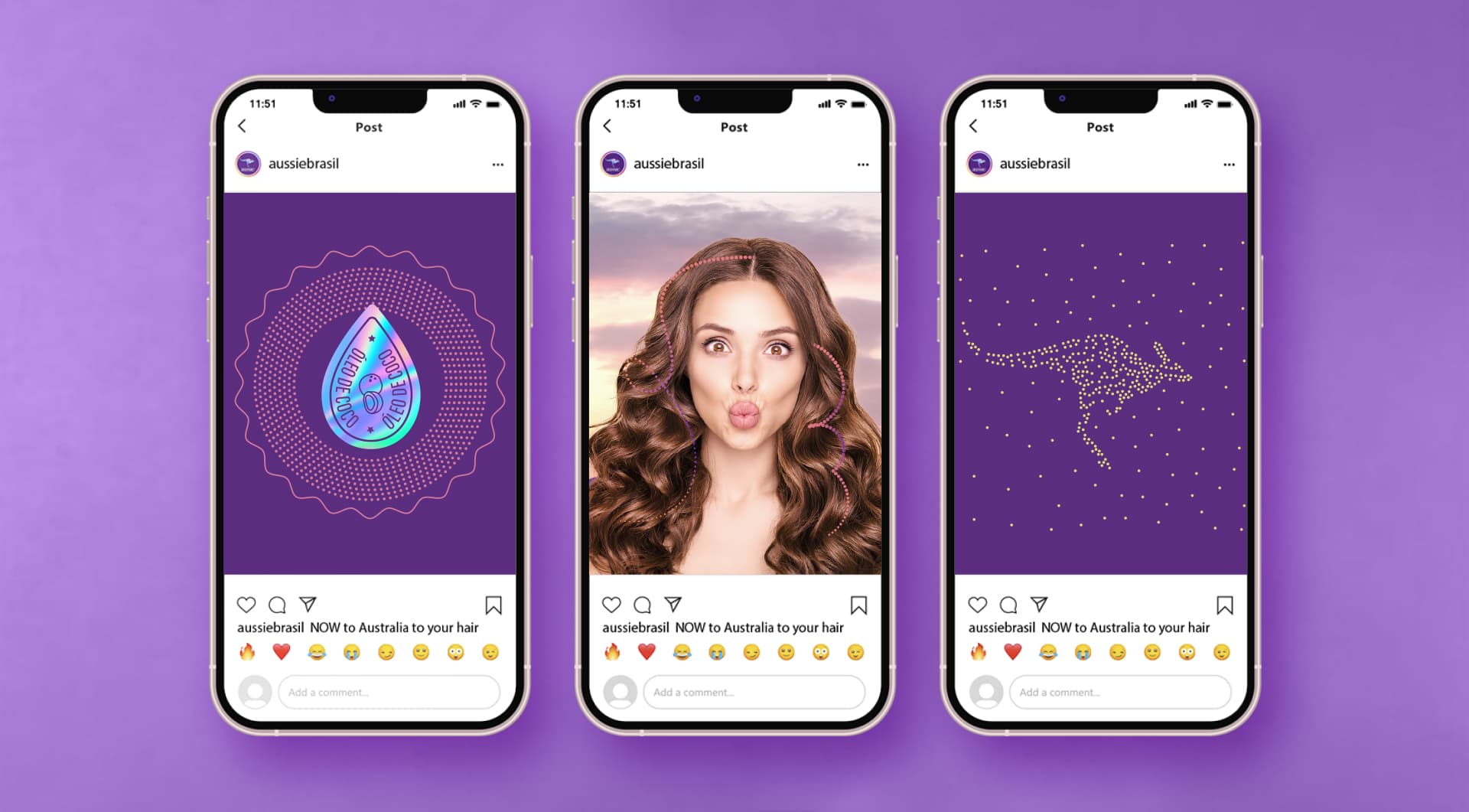
Las decisiones quedaron registradas en guidelines de aplicación, lo que hizo que el estándar sobreviviera a la entrega. Aussie adoptó el rediseño y lo llevó a packaging, punto de venta y digital.